UI / UX Design How do you design a digital space that transforms a devastating statistic into a deeply human, interactive memorial?

6402+ | Seeds of Memory

ROLE

UI/UX Designer & Researcher

TIMELINE

2025 - Ongoing

TOOLS

Figma, Illustrator, Miro

DELIVERABLES

UX Strategy, Wireframes, High-Fidelity UI

View Interactive Prototype

Project Overview

6402+ is not just a platform; it's a digital sanctuary. Designed to honor victims and preserve history, the interface guides users through a sensitive, empathetic journey bridging the gap between grief, data visualization, and collective remembrance.

The Challenge

How to visually and respectfully represent over 6,402 victims without reducing them to mere statistics or overwhelming the user with heavy data. The platform needed to feel human, accessible, and emotionally resonant.

The Solution

A carefully structured web experience that uses symbolic interactions—like planting a "seed of memory"—alongside a geographical map and audio-visual archives to ground the data in real human stories.

My Role & Contributions

In the 6402+ project, my focus centered on bridging the gap between product strategy and technical execution. As the Product Manager, I guided the project's overarching direction, ensuring that our features consistently aligned with the highly sensitive nature of the memorial and the emotional needs of our users.

Unity Developer: The Map of Memories

Technically, my main role was developing the core interactive product—the "Map of Memories" (Un mapa de memorias). Using Unity, I was responsible for programming the map environment, plotting the data, and ensuring a seamless, respectful, and interactive geographic visualization of the victims' stories.

Design Process

Designing a platform dealing with memory and grief required a meticulous and highly sensitive approach. We followed a structured design thinking framework to ensure every interaction felt respectful.

01. Empathize

Understanding the emotional weight of the survivors and public.

02. Define

Establishing boundaries for respectful data visualization.

03. Ideate

Creating the "Seeds" concept and interaction models.

04. Test & Iterate

Ensuring accessibility and appropriate emotional pacing.

User Research: Target Audience

To truly understand our users and tailor the experience to their specific needs, we developed detailed buyer personas based on our research. This helped us align the platform's goals with the expectations of key community members.

V

Valentina Rojas

28 years old • Bogotá
Human Rights Defender

Motivations

  • Seek truth and justice
  • Honor the memory of the victims

Goals

  • Give visibility to the stories
  • Connect with like-minded people

Frustrations

  • Social indifference
  • Lack of empathy
C

Carlos Gómez

45 years old • Medellín
Educator

Motivations

  • Educate about history
  • Build social awareness

Goals

  • Find educational tools
  • Promote historical memory in youth

Frustrations

  • Misinformation
  • Lack of interest among youth

Empathy Mapping

By synthesizing these profiles, we mapped the collective emotional state, thoughts, and actions when interacting with the memorial. This guided every UX decision to ensure a respectful and impactful journey.

THINKS & FEELS

Focuses on the emotional weight of memory, a desire for justice, and the deep need for a respectful space to honor the past.

HEARS

The voices of the past, stories from others who share the grief, and news regarding the historical context of the victims.

SEES

A digital landscape of names, visual tributes, and the interactive "seeds" left by other users contributing to the memorial.

SAYS & DOES

She actively participates by leaving a tribute, reading the stories, and sharing the memorial link to keep the collective memory alive.

Visual Foundation

The UI needed to be invisible enough to let the stories breathe, but present enough to guide the user. The typography and expanded 8-color palette draw from natural, grounded elements to honor the subject matter respectfully.

Typography & Color
Montserrat
Title
35px Bold
Subtitle
30px Semibold
Paragraph
18px Medium
Aa Bb Cc Dd Ff Gg Hh Ii Jj Kk Ll
Mm Nn Ññ Oo Pp Qq Rr Ss Tt Uu
Vv Ww Xx Yy Zz 0123456789
@ # $ % & * ¿ ¡ . , ; : - _ ' " « » á é í ó
ú ü ñ Ñ ! ? © ® °
#473B32
RGB (71, 59, 50)
Dark Lava
#836857
RGB (131, 104, 87)
Pastel Brown
#F1E8D9
RGB (241, 232, 217)
Eggshell
#F3B163
RGB (243, 177, 99)
Rajah
#E9C35F
RGB (233, 195, 95)
Arylide Yellow
#F289A1
RGB (242, 137, 161)
Pink Sherbet
#ED7ABA
RGB (237, 122, 186)
Persian Pink
#F87A64
RGB (248, 122, 100)
Coral Reef

UI Components & Iconography

Building upon our foundational colors and typography, we developed a comprehensive UI Kit. This ensures visual consistency across the platform while providing scalable, accessible components for future development.

6402+ UI Kit Components

Wireframes & Structure

Before moving to high-fidelity designs, I created structural wireframes to map out the user journey. This phase focused entirely on information architecture, prioritizing clear storytelling and intuitive navigation without the distraction of visual styles.

Home Wireframe
Home
Victim Profiles Wireframe
Victim Profiles
Add Your Seed Form
Add Your Seed
Map of Memories Wireframe
Map of Memories

Core Experiences

I designed four primary interaction pillars that turn passive reading into active participation.

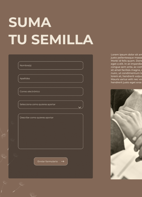
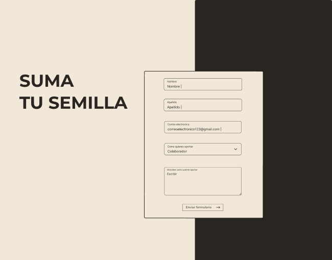
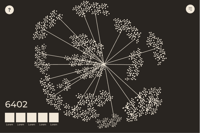
Micro-InteractionAdd Your Seed

A core interaction allowing users to leave a digital tribute ("Add your seed"). This was designed to feel organic, giving users a tangible, visual way to participate in the memorial and watch the community support grow in real-time.

Add Your Seed UI Mockup

Data VisualizationA Map of Memories

An interactive geographical visualization. By grounding the data in real locations, the map helps users comprehend the scale and reality of the events. Filtering tools allow users to search by region or year without feeling overwhelmed.

Map of Memories UI Mockup

Content LayoutDiscover Their Stories

A dedicated, distraction-free reading environment designed to humanize the statistics. Focuses heavily on legibility and emotional resonance through careful typography, ample whitespace, and integrated "Voices of the past" audio controls.

Discover Their Stories UI Mockup

Key Takeaways

Designing 6402+ taught me that UX is not just about reducing friction; sometimes, it's about creating meaningful friction.

By carefully pacing the user journey, we allowed space for reflection. The biggest challenge was balancing comprehensive data with emotional sensitivity, resulting in a platform that doesn't just display information, but facilitates a collective grieving and remembrance process.

The Final Result

The culmination of this research and design process is a fully interactive prototype that brings the 6402+ memorial to life. Experience the sensitive micro-interactions, explore the map, and discover the stories firsthand.

View Interactive Prototype